Expanding Dates for Groups with Differing Date Ranges
Since the start of the pandemic I have been working on and off on covid data. One of the defining features of these data sets is the start date for each country is different. We are looking at events that happen after the start of the pandemic, but covid reached each country at different times so we end up with a data set that looks something like this:
library(dplyr)
library(tidyr)
library(lubridate)
library(ggplot2)
library(purrr)
library(rbenchmark)
# Load in plot theme for
source("../../plot_options.R")

data<- tribble(
  ~country,         ~event_date,   ~count,
  "United Kingdom",  "3/08/2020",      1,
  "United Kingdom",  "4/15/2020",      2,
  "United Kingdom",  "6/23/2020",      3,
  "United Kingdom",  "7/03/2020",      4,
  "United Kingdom",  "10/31/2020",     5,
  "South Africa",    "6/14/2020",      1,
  "South Africa",    "8/06/2020",      2,
  "South Africa",    "9/23/2020",      3,
  "South Africa",    "12/31/2020",     4,
  "Italy",          "2/16/2020",       5,
  "Italy",          "3/09/2020",       6,
  "Italy",          "8/27/2020",       7,
  "Italy",          "10/18/2020",      8,
  "Italy",          "11/30/2020",      9
) %>%
  mutate(event_date = mdy(event_date),
         count = as.integer(count))
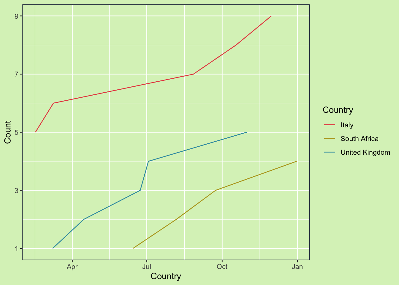
If we plot the data like this it will display incorrectly. With only event data, ggplot assumes linear connections between time points, which is misleading for this data.
ggplot(data, aes(x = event_date, y = count, color = country)) +
  geom_line() +
  guides(color = guide_legend("Country")) +
  scale_color_blog() +
  scale_y_continuous(breaks=seq(1, 10, by = 2)) +
  xlab("Country") +
  ylab("Count") +
  my_theme()
One option is to convert the data from continuous to discrete. But, this can make it harder to make summaries across groups later. The other option is to convert the data from event based, to weekly. This will make it easier to use in future calculations and will improve the graph. Tidyr has some nice functions which makes this easy.
min_date <- data %>% pull(event_date) %>% min()
max_date <- data %>% pull(event_date) %>% max()


data_weekly <- data %>%
  complete(event_date = seq(min_date, max_date, by = "week"),
           nesting(country)) %>%
  group_by(country) %>%
  arrange(country, event_date) %>%
  fill(count, .direction = "down") %>%
  rename(date = event_date)

head(data_weekly)
## # A tibble: 6 x 3
## # Groups: country [1]
## date country count
## <date> <chr> <int>
## 1 2020-02-16 Italy 5
## 2 2020-02-23 Italy 5
## 3 2020-03-01 Italy 5
## 4 2020-03-08 Italy 5
## 5 2020-03-09 Italy 6
## 6 2020-03-15 Italy 6Now, we have weekly counts for each country. But, if we look at South Africa there are a few weeks with missing data.
## # A tibble: 6 x 3
## # Groups:   country [1]
##   date       country      count
##   <date>     <chr>        <int>
## 1 2020-02-16 South Africa    NA
## 2 2020-02-23 South Africa    NA
## 3 2020-03-01 South Africa    NA
## 4 2020-03-08 South Africa    NA
## 5 2020-03-15 South Africa    NA
## 6 2020-03-22 South Africa    NA
This is because South Africa didn’t have their first event in the pandemic until June, but our starting date was in February. We can just remove the missing values afterwards, but I always find that a bit sloppy. So instead, we need to nest the country level information prior to filling in the dates.
data_weekly2 <- data %>%
  nest(data = c(event_date, count)) %>%
  mutate(data = map(data, function(x){
    min_date <- x %>% pull(event_date) %>% min()
    max_date <- x %>% pull(event_date) %>% max()
    x %>%
      complete(event_date = seq(min_date, max_date, by = "week")) %>%
      arrange(event_date) %>%
      fill(count, .direction = "down")
  })) %>%
  unnest(data) %>%
  rename(date = event_date)
If we look at South Africa again now we don’t see the missing values from before.
## # A tibble: 6 x 3
##   country      date       count
##   <chr>        <date>     <int>
## 1 South Africa 2020-06-14     1
## 2 South Africa 2020-06-21     1
## 3 South Africa 2020-06-28     1
## 4 South Africa 2020-07-05     1
## 5 South Africa 2020-07-12     1
## 6 South Africa 2020-07-19     1
Instead the count starts in June when the first event occurs.
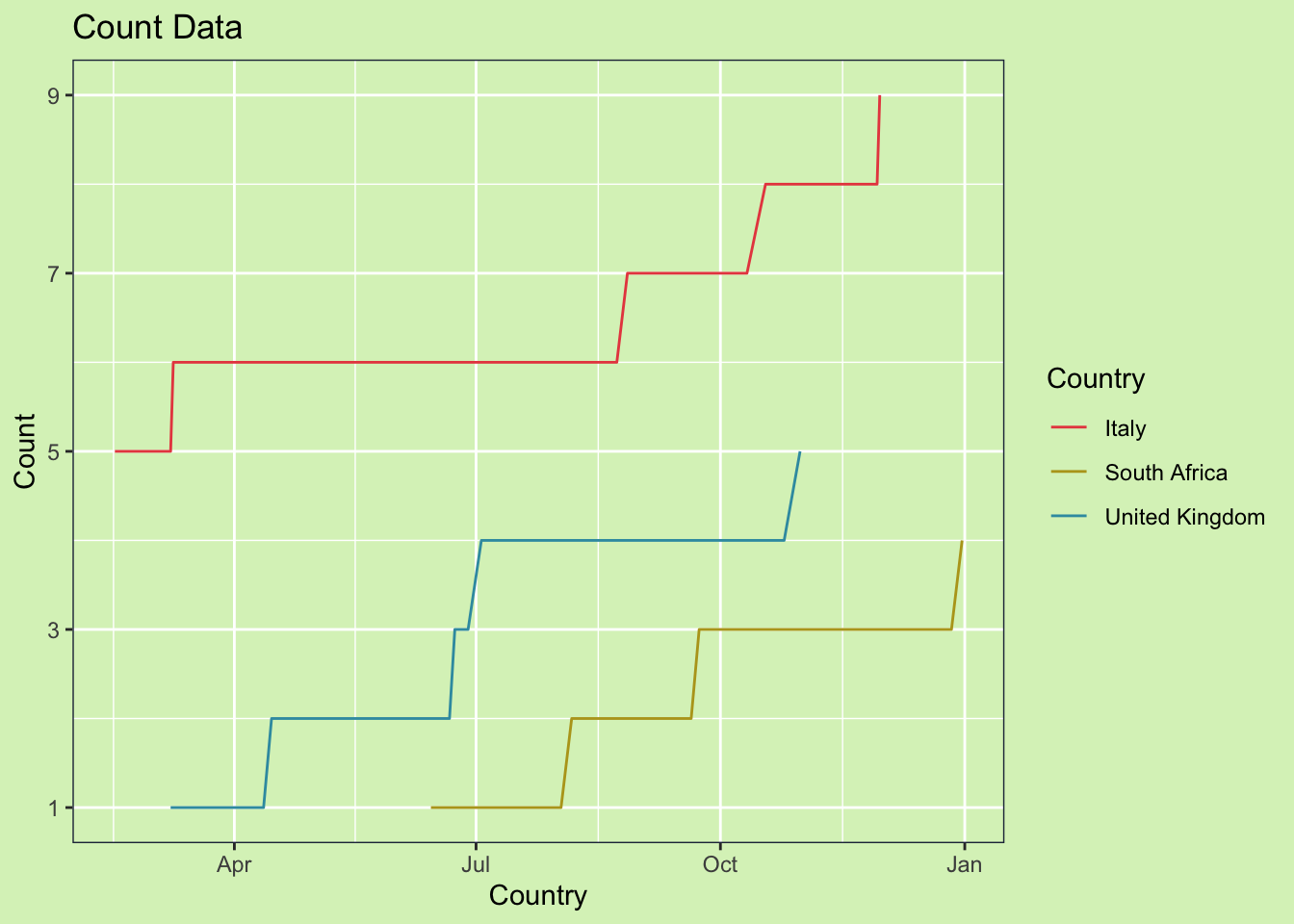
Now if we go back to the original plot, we can see how it displays the information more accurately.
ggplot(data_weekly2, aes(x = date, y = count, color = country)) +
  geom_line() +
  guides(color = guide_legend("Country")) +
  scale_y_continuous(breaks=seq(1, 10, by = 2)) +
  scale_color_blog() +
  xlab("Country") +
  ylab("Count") +
  ggtitle("Count Data") +
  my_theme()